set.seed(123)
ts_sim = runif(365, 5, 10) + seq(-140, 224)^2 / 10000
day = as.Date("2025-06-14") - 0:3641 Exploring and Visualizing ARIMA Models in R
How do you train ARIMA model in your time series models? Grid search, or Hyndman and Khandaka (2008) algorithm? I created this document to demonstrate you how to fit every possible ARIMA models using grid search with visualization. This is a basic problem of hyperparameter tuning. I prepare a simulated time series, and visualize the fitted values of every possible ARIMA models with ‘ggplot2’ and make it interactive with ggiraph.
1.1 Introduction
The ARIMA (AutoRegressive Integrated Moving Average) model is defined by three parameters:
- p: Autoregressive order that counts the past lagged terms (This is AR in ARIMA context)
- d: Differencing order that counts the number of differencing to achieve stationarity (This is ‘I’ or “integrate” in ARIMA context)
- q: Moving average order that counts the past error lagged terms (MA)
Choosing the right combination of (p, d, q) is…not that easy, right when you want to achieve the best fit, even with Hyndman and Khandaka (2008) methodology with their forecast::auto.arima().
This is how it’s done:
- Prepare a time series data. I generate a time series data from this in order for you to replicate this.
- Then fit every possible ARIMA models across a grid of (p, d, q) values.
- Then evaluate the models performance by calculating the maximum log-likelihood then weight them with AIC (Akaike Information Criterion) and BIC (Bayesian Information Criterion).
- Then visualize the fitted values from every possible models, alongside the actual data.
- From the visual, highlight the best model in red.
- Optionally, you can make it interactive, using ‘ggiraph’, and I prepare it so that you can hover and explore model fits.
The packages used:
- box (v1.2.0)
- ggplot2 (v4.0.0)
- ggiraph (v0.9.1)
- purrr (v1.0.2)
- dplyr (v1.1.4)
- forecast (v8.23.0)
- glue (v1.7.0)
- tidyr (v1.3.1)
- rlang (v1.1.4)
- scales (v1.4.0)
1.2 Simulating Data
We generate a synthetic dataset with some trend and randomness:
This produces 365 daily observations with both trend and noise, which is a good test case for ARIMA.
1.3 Fitting Multiple ARIMA Models
We test a grid of ARIMA parameters:
\[ \begin{aligned} p &\in \{0,1,2\} \\ d &\in \{0,1\} \\ q &\in \{0,1,2\} \end{aligned} \]
We exclude overly complex models where p + q > 3.
Code
models = local({
    box::use(
        purrr[pmap, pmap_chr, possibly, map, map_dbl],
        dplyr[transmute, mutate, filter, slice_min, slice, case_when],
        forecast[Arima],
        glue[glue],
        tidyr[expand_grid],
        rlang[exec]
    )

    expand_grid(p = 0:2, d = 0:1, q = 0:2) |>
        transmute(
            models = pmap_chr(
                pick(1:3),
                \(p, d, q) glue("ARIMA({p},{d},{q})")
            ),
            res = pmap(
                pick(1:3),
                possibly(
                    function (p, d, q) {
                        if (p + q > 3) return(NULL)
                        exec(Arima, as.ts(ts_sim), order = c(p, d, q))
                    },
                    otherwise = NULL
                )
            ),
            fits = map(res, ~ if(is.null(.x)) NULL else fitted(.x)),
            aic = map_dbl(res, ~ if(is.null(.x)) NA_real_ else AIC(.x)),
            bic = map_dbl(res, ~ if(is.null(.x)) NA_real_ else BIC(.x))
        ) |>
        filter(!is.na(aic)) |>  # Remove failed models
        mutate(
            day = list(day),
            is_lowest_aic = aic == min(aic, na.rm = TRUE),
            is_lowest_bic = bic == min(bic, na.rm = TRUE)
        )
})
models
This gives us a nested data frame of fitted models with their AIC, BIC, and fitted values.
1.4 Visualizing Models with ggplot2
Do you want to visualize everything better, including the actual, fitted values, and highlight the fitted values made by the best fit?
From models data, we just need the is_lowest_aic and is_lowest_bic. We just need to tweak the data a little bit here by expanding the fitted values with its corresponding data value. Then, set the model_type to condition the plotting data with dplyr::case_when().
plot_data = local({
    box::use(
        tidyr[unnest],
        dplyr[mutate, case_when]
    )
    models |>
        unnest(cols = c(day, fits)) |>
        mutate(
            model_type = case_when(
                is_lowest_aic ~ "Best AIC",
                is_lowest_bic ~ "Best BIC",
                TRUE ~ "Other Models"
            )
        )
})
Optionally:
You can put the information about the model which had the lowest AIC and BIC in an annotated box text in the plot.
best_model_1 = models |> dplyr::filter(is_lowest_aic)
best_model_2 = models |> dplyr::filter(is_lowest_bic)
Pointing out the maximum value of the time series data
max_val = max(ts_sim)
max_idx = which.max(ts_sim)
max_day = day[max_idx]
Then, visualize:
Code
local({
    box::use(
        ggplot2[...],
        scales[comma],
        dplyr[filter],
        glue[glue],
    )

    p = ggplot() +
        # Original data
        geom_line(
            aes(x = day, y = as.numeric(ts_sim)),
            linewidth = 1.2,
            color = "#2C3E50",
            alpha = 0.8
        ) +
        geom_point(
            aes(x = day, y = as.numeric(ts_sim)),
            size = 0.8,
            color = "#2C3E50",
            alpha = 0.6
        ) +

        # Other fitted models (light gray)
        geom_line(
            data = filter(plot_data, model_type == "Other Models"),
            aes(x = day, y = fits, group = models),
            color = '#BDC3C7',
            alpha = 0.6,
            linewidth = 0.5
        ) +

        # Best BIC model (blue)
        geom_line(
            data = filter(plot_data, model_type == "Best BIC"),
            aes(x = day, y = fits, group = models),
            color = '#3498DB',
            linewidth = 1.2,
            alpha = 0.9
        ) +

        # Best AIC model (red, on top)
        geom_line(
            data = filter(plot_data, model_type == "Best AIC"),
            aes(x = day, y = fits, group = models),
            color = '#E74C3C',
            linewidth = 1.5,
            alpha = 0.9
        ) +

        # Peak annotation
        annotate(
            "point",
            x = max_day, y = max_val,
            size = 4, colour = "#E74C3C", shape = 21, stroke = 2, fill = "white"
        ) +
        annotate(
            "text",
            x = max_day + 25,
            y = max_val + 0.5,
            label = paste0("Peak: ", round(max_val, 1), " sec"),
            color = "#E74C3C",
            fontface = "bold",
            size = 3.5
        ) +
        annotate(
            "curve",
            x = max_day + 20, xend = max_day + 0.1,
            y = max_val + 0.3, yend = max_val,
            linewidth = 0.8,
            color = "#E74C3C",
            curvature = -0.2,
            arrow = arrow(length = unit(0.15, "cm"), type = "closed")
        ) +

        # Model performance text box
        annotate(
            "rect",
            xmin = min(day) + 20, xmax = min(day) + 100,
            ymin = max(ts_sim) - 1.5, ymax = max(ts_sim) - 0.2,
            fill = "white", color = "#34495E", alpha = 0.9
        ) +
        annotate(
            "text",
            x = min(day) + 60, y = max(ts_sim) - 0.5,
            label = paste0("Best AIC: ", best_model_1$models,
                           "\nAIC = ", round(best_model_1$aic, 1)),
            color = "#E74C3C", fontface = "bold", size = 3.2
        ) +
        annotate(
            "text",
            x = min(day) + 60, y = max(ts_sim) - 1.1,
            label = paste0("Best BIC: ", best_model_2$models,
                           "\nBIC = ", round(best_model_2$bic, 1)),
            color = "#3498DB", fontface = "bold", size = 3.2
        ) +

        # Styling
        scale_x_date(date_labels = "%b %Y", date_breaks = "2 months") +
        scale_y_continuous(labels = comma) +

        labs(
            x = "Time Index",
            y = "Simulated Response Values",
            title = "ARIMA Model Grid Search: Simulated Time Series Analysis",
            subtitle = glue("Comparing {nrow(models)} successful ARIMA models • Best performing models highlighted"),
            caption = paste0("Models tested: p∈[0,2], d∈[0,1], q∈[0,2] • ",
                             "Original data shown in dark gray • ",
                             "Total observations: ", length(ts_sim))
        ) +

        theme_minimal(base_size = 11, base_family = "serif") +
        theme(
            plot.title = element_text(
                family = "serif",
                colour = "#2C3E50",
                size = 14,
                face = "bold",
                margin = margin(b = 5)
            ),
            plot.subtitle = element_text(
                family = "serif",
                colour = "#7F8C8D",
                size = 10,
                margin = margin(b = 15)
            ),
            plot.caption = element_text(
                family = "serif",
                colour = "#95A5A6",
                size = 8,
                margin = margin(t = 10)
            ),
            axis.text.x = element_text(
                angle = 45,
                hjust = 1,
                margin = margin(t = 8),
                color = "#34495E"
            ),
            axis.text.y = element_text(
                margin = margin(r = 8),
                color = "#34495E"
            ),
            axis.title = element_text(
                color = "#2C3E50",
                face = "bold"
            ),
            panel.grid.minor = element_blank(),
            panel.grid.major = element_line(
                color = "#ECF0F1",
                linewidth = 0.3
            ),
            panel.background = element_rect(fill = "#FEFEFE", color = NA),
            plot.background = element_rect(fill = "white", color = NA),
            plot.margin = margin(20, 20, 20, 20)
        )

    p
})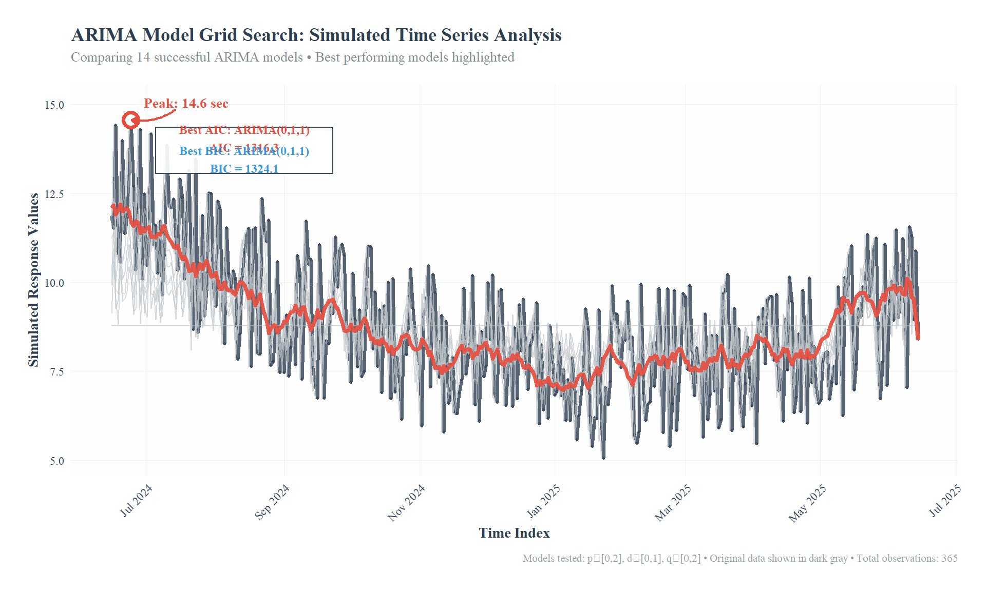
We visualize:
- Original data (dark gray)
- All fitted values from every possible ARIMA model (light gray), except, the fitted values from the best fit is highlighted (red, blue, based on AIC, BIC, respectively)
- Annotated peak point in the data
- Annotated best AIC/BIC values
1.5 Optional: Interactive Visualization with ggiraph
If you prefer your plot to be interactive like some figures in the website, use ‘ggiraph’ interactive interface version of ggplot2, then girafe(). The output produced by girafe() is wrapped with HTML, so it can be run in web.
I recommend ‘ggiraph’ to build web applications in R.
This is the interactive version of the plot above:
Code
local({
    box::use(
        ggplot2[...],
        scales[comma],
        dplyr[filter, mutate, case_when],
        glue[glue],
        ggiraph[geom_line_interactive, geom_point_interactive, girafe, opts_hover, opts_hover_inv, opts_selection],
        tidyr[unnest]
    )

    # Use this for preparation
    original_data = data.frame(
        day = day,
        ts_sim = ts_sim,
        tooltip_line = "actual data",
        tooltip_point = paste0(format(day, "%Y-%m-%d"), "; readings: ", round(ts_sim, 1), " secs")
    )

    plot_data = models |>
        unnest(cols = c(day, fits)) |>
        mutate(
            model_type = case_when(
                is_lowest_aic ~ "Best AIC",
                is_lowest_bic ~ "Best BIC",
                TRUE ~ "Other Models"
            ),
            # Create tooltip text for model lines
            tooltip_text = case_when(
                is_lowest_aic ~ paste0("best model: ", models, "; AIC = ", round(aic, 2), "; BIC = ", round(bic, 2)),
                is_lowest_bic ~ paste0("best model: ", models, "; AIC = ", round(aic, 2), "; BIC = ", round(bic, 2)),
                TRUE ~ paste0("model: ", models, "; AIC = ", round(aic, 2), "; BIC = ", round(bic, 2))
            )
        )

    p = ggplot() +
        geom_line_interactive(
            data = original_data,
            aes(x = day, y = ts_sim, tooltip = tooltip_line, data_id = "original_line"),
            linewidth = 1.2,
            color = "#2C3E50",
            alpha = 0.8
        ) +
        geom_point_interactive(
            data = original_data,
            aes(x = day, y = ts_sim, tooltip = tooltip_point),
            size = 0.8,
            color = "#2C3E50",
            alpha = 0.6
        ) +

        geom_line_interactive(
            data = filter(plot_data, model_type == "Other Models"),
            aes(x = day, y = fits, group = models, tooltip = tooltip_text, data_id = models),
            color = '#BDC3C7',
            alpha = 0.6,
            linewidth = 0.5
        ) +

        geom_line_interactive(
            data = filter(plot_data, model_type == "Best BIC"),
            aes(x = day, y = fits, group = models, tooltip = tooltip_text, data_id = models),
            color = '#3498DB',
            linewidth = 1.2,
            alpha = 0.9
        ) +

        geom_line_interactive(
            data = filter(plot_data, model_type == "Best AIC"),
            aes(x = day, y = fits, group = models, tooltip = tooltip_text, data_id = models),
            color = '#E74C3C',
            linewidth = 1.5,
            alpha = 0.9
        ) +

        scale_x_date(date_labels = "%b %Y", date_breaks = "2 months") +
        scale_y_continuous(labels = comma) +

        labs(
            x = "Time Index",
            y = "Simulated Response Values",
            title = "ARIMA Model Grid Search: Simulated Time Series Analysis",
            subtitle = glue("Comparing {nrow(models)} successful ARIMA models • Best performing models highlighted"),
            caption = paste0("Models tested: p∈[0,2], d∈[0,1], q∈[0,2] • ",
                             "Original data shown in dark gray • ",
                             "Total observations: ", length(ts_sim))
        ) +

        theme_minimal(base_size = 11, base_family = "serif") +
        theme(
            plot.title = element_text(
                family = "serif",
                colour = "#2C3E50",
                size = 14,
                face = "bold",
                margin = margin(b = 5)
            ),
            plot.subtitle = element_text(
                family = "serif",
                colour = "#7F8C8D",
                size = 10,
                margin = margin(b = 15)
            ),
            plot.caption = element_text(
                family = "serif",
                colour = "#95A5A6",
                size = 8,
                margin = margin(t = 10)
            ),
            axis.text.x = element_text(
                angle = 45,
                hjust = 1,
                margin = margin(t = 8),
                color = "#34495E"
            ),
            axis.text.y = element_text(
                margin = margin(r = 8),
                color = "#34495E"
            ),
            axis.title = element_text(
                color = "#2C3E50",
                face = "bold"
            ),
            panel.grid.minor = element_blank(),
            panel.grid.major = element_line(
                color = "#ECF0F1",
                linewidth = 0.3
            ),
            panel.background = element_rect(fill = "#FEFEFE", color = NA),
            plot.background = element_rect(fill = "white", color = NA),
            plot.margin = margin(20, 20, 20, 20)
        )

    interactive_plot = girafe(
        ggobj = p,
        options = list(
            opts_hover(css = "cursor:pointer;stroke-width:4;stroke-opacity:1;fill-opacity:1;r:4px;"),
            opts_hover_inv(css = "opacity:0.1;"),
            opts_selection(type = "none")
        )
    )

    interactive_plot
})
1.6 Disclaimer
This is just a toy example of leveraging functional programming and basic hyperparameter tuning for time series in R, and some of my learning competencies about data visualization in R and how to get deeper in it.
If you are interested to learn more, check out my other gists.